Supernova homepage, lifting D1/D2/D3 activity
When I joined Supernova, the homepage was trying to be two things at once. A playground for kids and a learning tool for adults. That's a losing bet. The screen couldn't decide who it was for, and neither could the users who landed on it.
I spent the next few months running iterations on this one screen. Small cohorts, quick tests, parents of the team as first users. What changed wasn't just the UI. What changed was the question we were asking.
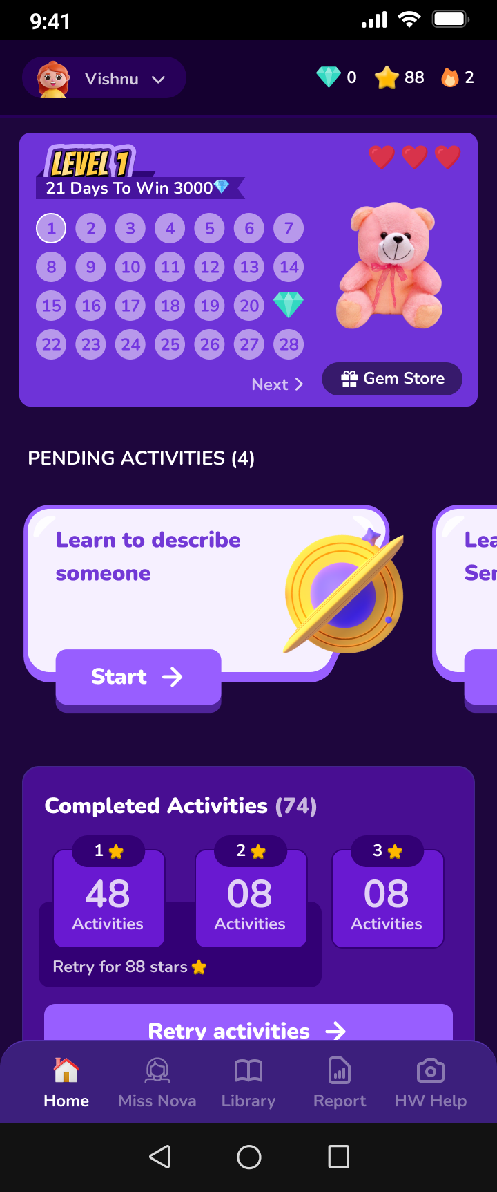
The old homepage was built for kids and adults at the same time. Levels, gem stores, teddy bears, pending activities, completed counts. Kids tapped anything colorful. Adults opened the app to learn and found a dashboard that felt like a game they didn't sign up for.
The first decision wasn't about pixels. It was about who we were willing to stop serving. We chose adults. Adults brought revenue, adults drove retention, adults were the reason the business could grow. Kids would get their own experience later.
We shipped a cleaner version. Dark theme, no teddy bears, no levels, just the activities surfaced up top. It looked better. It didn't move the numbers. D1, D2, D3 activity attempt rates were flat, sometimes worse. The design was nicer but it was still answering the wrong question.
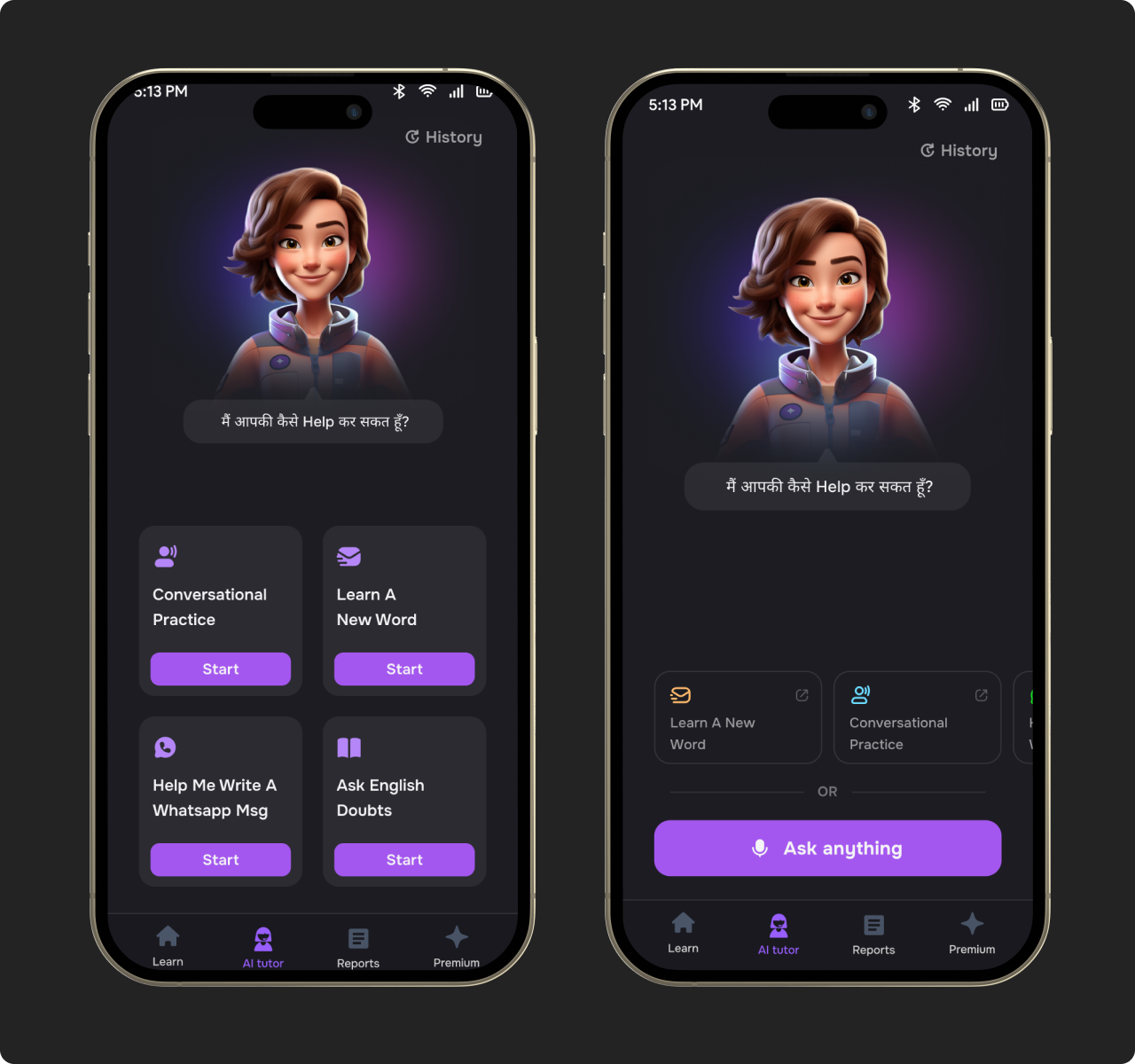
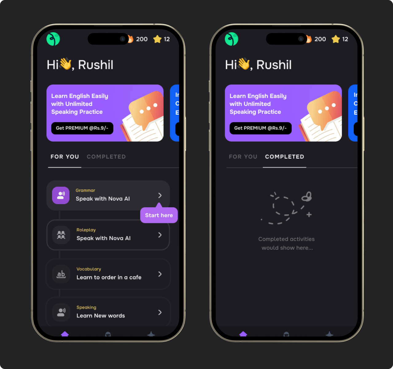
One thing kept showing up in the data. Users landed on the homepage, ignored most of it, and tapped straight into conversational practice. Again and again.
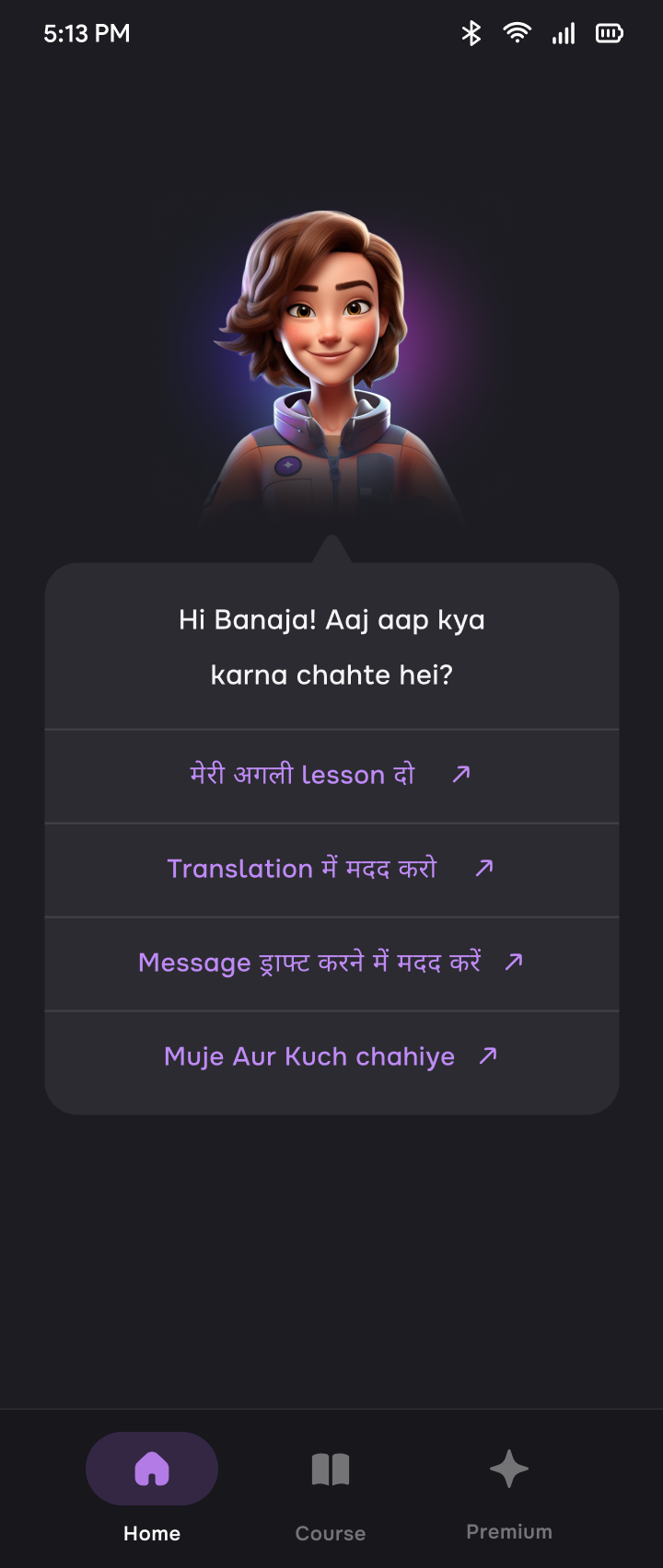
So we flipped the homepage. Instead of a grid of features, we put Nova, our mascot, at the center. A face, a greeting, a clear sense that you were talking to someone. The homepage became the conversation itself.
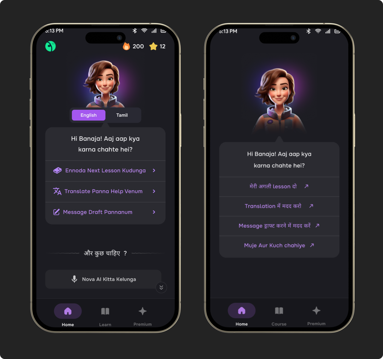
We stopped testing with designers and PMs. We started sending screenshots to the parents of everyone on the core team. Tier 3, tier 4 users like ours don't read feature lists. They either get it in five seconds or put it down. I sat with each parent for an hour or two. The simplified version, with Nova talking to them in their own language, was the only one every parent understood immediately.
We shipped it. D1, D2, D3 attempt rates lifted. Pay percentages went up. The homepage was finally doing its job. But it opened up a new problem: Day 2 retention. Users who came in did the activity, but dropped off after. The ones who stuck around were the conversational practice users. That became the next thing to fix.